Purpose
The purpose of this evaluation model is to test the usability of the paper prototype for the Human Centered Design and Engineering (HCDE) widget. The focus of the prototype is to help HCDE students comfortably and effectively find HCDE-related information and to personalize students’ experience in information searching. By observing HCDE students interacting with our paper prototype and collecting real-time qualitative feedback, we aim to examine the strengths and weaknesses of our design so to make corresponding changes for future development.
Methods
For each round of evaluation, there were a facilitator, a note-taker, and a computer. The role of the facilitator was to guide the participants throughout the testing and prompt them for verbal feedback. At the same time, the note-taker took notes about the evaluation process, including the questions asked by the facilitators and the responses given by the participants. The computer was responsible for changing the screens of paper prototypes to mimic the different states of interaction, as the participants navigated through the tasks. Throughout the evaluation the facilitator was able to probe and have the participant think aloud, gaining more information about the strengths and weaknesses of the design.
In addition, the paper prototype was designed based on a desktop from Apple’s Mac System in mind. This should be noted, as some applicational functions differ between Mac and Windows desktop (e.g., closing a web browser).
Pre-Observation Interview
We asked each participant two questions before starting the testing, so to get more background information before the observational phase.
A. Are you a current or prospective HCDE student? (The question helped us get a clear understanding on the participant’s background knowledge and experience with HCDE-related resources.)
B. Are you currently a Mac or Windows user? (This question gave us more information on if designing our widget based on the Mac operating system created more familiarity to the participant or not.)
Task Completion and Observations
We asked each participant to complete the three following tasks. We did not help participants when stuck, because we wanted them to work through each task on their own. We also asked participants to do think-aloud protocol to understand their thought process throughout the tasks. This helped us see what worked well and what did not.
Post-Observation Interview
Post-observation was used to pull more information out of the participants. This phase allowed us to get other information besides the tasks. Also, this opened up the discussion for participants to be honest and talk about the general experience.
A. We asked the participants if there was anything else they wanted to say about the prototype or the overall experience.
B. We asked the participants several “what if” questions to gage what directions the design could be steered into in the future.
Tasks and Logistics
1. Open the HCDE widget
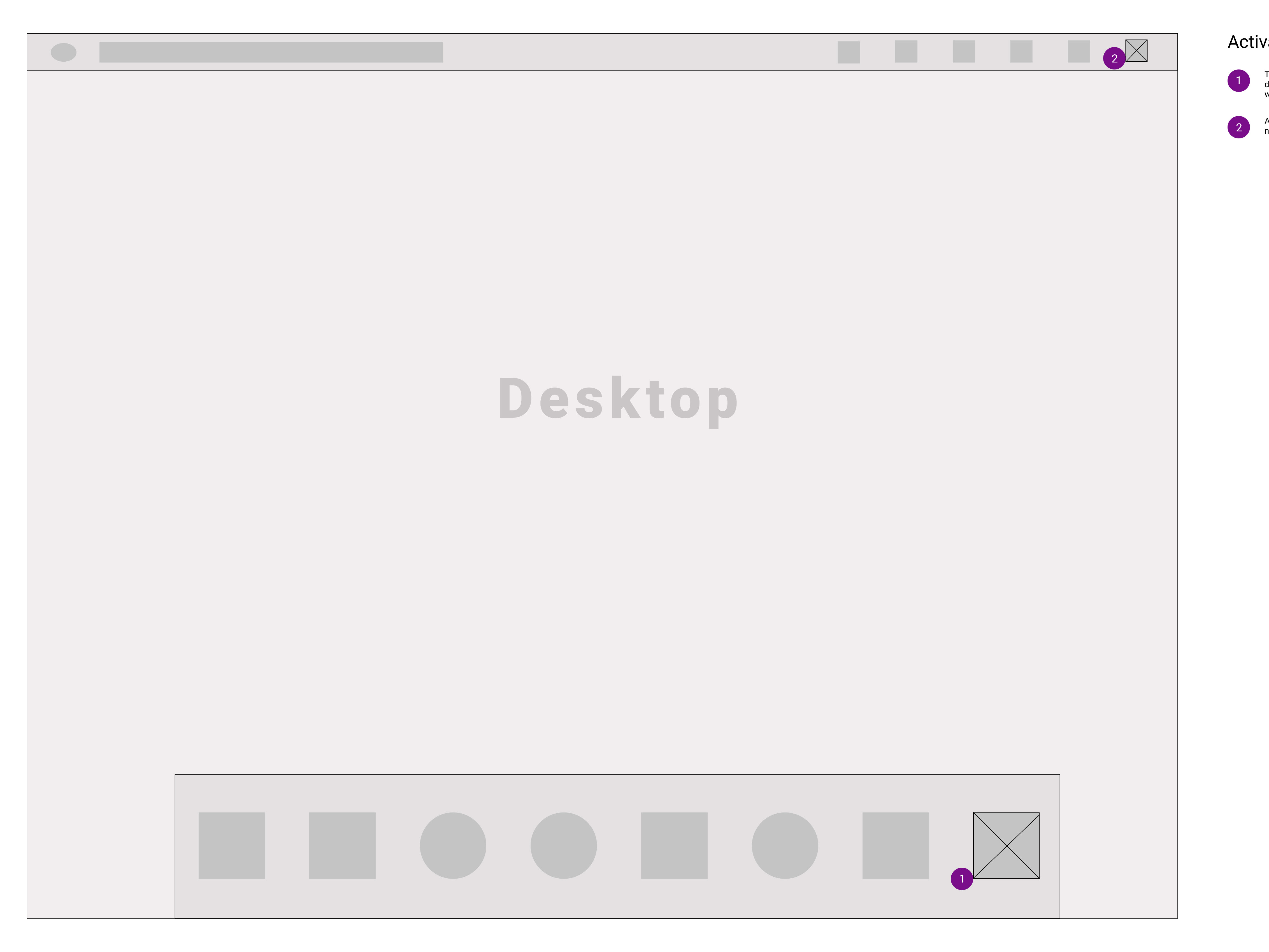
Users start off on a desktop and are asked to open the HCDE widget. Once they click on the widget, it will pop onto one side of the screen as a small square, displaying a circular dashboard which shows five circular resource icons. Users can drag and place the HCDE widget anywhere on their screens; they can drag the border of the circular dashboard to enlarge or reduce its size; also, they can drag, edit, and rearrange what resource icons to be displayed on the dashboard. Completion of this task occurs when the participant clicked on the HCDE widget on the bottom dash of the desktop or the icon on the top of the desktop.
Users start off on a desktop and are asked to open the HCDE widget. Once they click on the widget, it will pop onto one side of the screen as a small square, displaying a circular dashboard which shows five circular resource icons. Users can drag and place the HCDE widget anywhere on their screens; they can drag the border of the circular dashboard to enlarge or reduce its size; also, they can drag, edit, and rearrange what resource icons to be displayed on the dashboard. Completion of this task occurs when the participant clicked on the HCDE widget on the bottom dash of the desktop or the icon on the top of the desktop.
2. Open and close a resource icon
Users are prompted to open and close a resource from the application dashboard. Once they click on a resource icon, the resource will be displayed either in a web browser or activated as an application, depending on the types of resources. Only HCDE-related information will be set as default. Users can close the window of their web browsers or application interfaces to complete Task 2. After exiting the resource, users can continue to access other resources in the circular dashboard. They can hide the HCDE square to one side of their computer screens by clicking the “minimize” button located on the top right corner of the HCDE widget square; they can also deactivate the HCDE widget by clicking the “close” button next to the “minimize” button. Completion of this task occurs when the participant successfully clicks on an icon, the web browser or application is opened and the participant closes the web browser or application.
3. Add resource to dashboard
To begin the process of adding an additional resource to the HCDE widget, users have to click the “add” button located on the outer border of the circular dashboard. Once hitting the “add” button, users will automatically enter the editing mode. A window will pop up below the “add” button asking for a link to a resource’s URL; the circular dashboard will expand to a linear dashboard; at the same time, all the circular resource icons will start jiggling on the spots, with the five main resources emphasized with thicker borders. In this editing mode, users can add a web-based resource by either typing or pasting the URL in the pop-up window, or they can drag the application alias from their desktops or file folders if the resource is an application itself. Completion of this task occurs when the participant clicks the plus button on the widget dash, types in the Slack URL or drag and drops the Slack icon, and clicks confirm.
Participants Profiles
Our target users include all Human Centered Design and Engineering (HCDE) undergraduate students at the University of Washington. The participants for this evaluation are four current and prospective HCDE students, with ages ranging from 19 to 21.
Participant V1:
He is a first-year HCDE student. He uses Windows system on his computer.
Participant D2:
He is a first-year HCDE student. He uses Windows system on his computer.
Participant S3:
She is a first-year HCDE student. She uses Windows system on her computer.
Participant M4:
He is a prospective HCDE student. He uses Mac system on his computer.
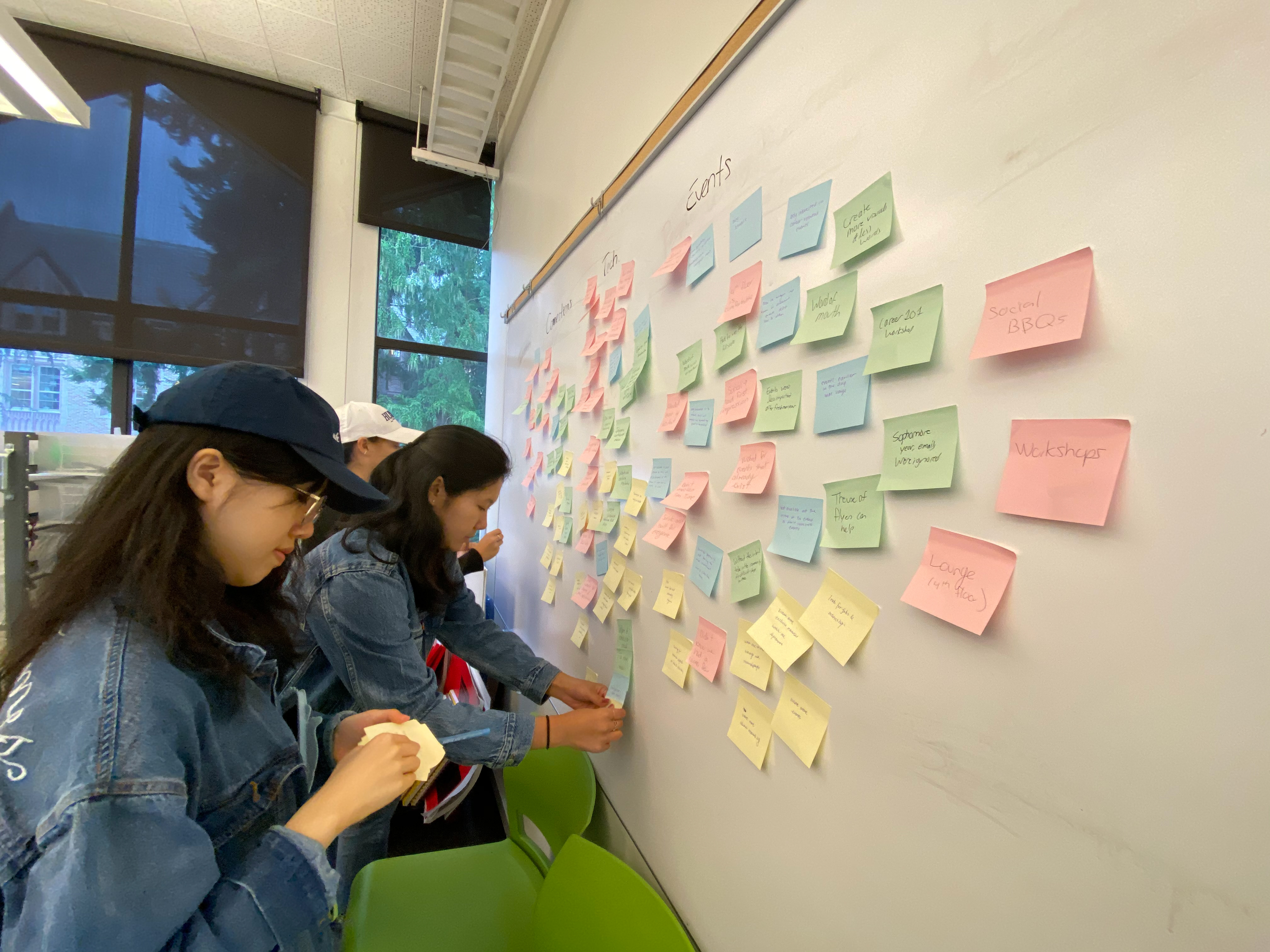
Findings
The following findings and suggested action items were based on our observations from testing the paper prototype with participants.
Finding 1: Edit/organize the dashboard with more flexibility
During the sessions, participants (V1,D2) asked about the circular dashboard and whether it moved or not and how you could see other resources within the half circle. From that we decided to change the layout of the design to make the circular dashboard spinnable, so users are able to scroll through a wheel of resources they have. During another session, one participant (S3) asked about how he can decide what resource icons to show up on the dashboard, as well as how to organize the resources he had and add what to the dashboard.
Suggestion 1: Turn circular dashboard to a linear dial
Based on the previous finding, we felt that the circular dashboard was complicated to look at, especially when the users were trying to organize the resource icons. The dashboard did not indicate any hierarchy to prioritize icons. In other words, we could not tell which top five icons would appear on the circular dashboard and how the rest would be hidden. As a team, we decided to make the circular dashboard flow out into a linear dial during the editing mode, and the top five icons would be bolded in the middle of the linear dial. After organizing the resource icons in a linear fashion, users could then wrap the dial back into the circular dashboard by clicking the “check” button. We chose to keep the aesthetic of the half circle after switching back to the viewing mode from the editing mode, because all users indicated their preference to this design.
Finding 2: Create alternative methods to add resources to the dashboard
Several participants (D2, S3, M4) questioned the usability of the pop-up window, which served to add a resource’ URL to the dashboard. For example, one participant (S3) said that: “For applications like Slack, I am not sure how I can add it to my dashboard.”
Suggestion 2: Include other ways of adding new resources
Based on our participants’ reactions and feedback, we decided to include an alternative way of adding a resource icon--simply by dragging the corresponding icon from the participants’ desktops or file folders and drop it to the linear dial during the editing mode. Also, all participants expected more interactions and animations when they were adding and deleting resource icons during the editing mode. Therefore, the gesture idiom of “dragging” was preserved when the participants were moving and/or reordering resources in the linear dial.
Finding 3: Personalize the widget placement
At the end of the session, participants (D2, M4) questioned whether or not the widget should be fixed on the right size of the desktop. Originally, the flat side of the widget was adjacent to the edge of the screen and the circular dashboard spread out in a half circle towards the middle of the screen. Another participant (S3) asked if the widget could change sizes by itself. She wondered if the square representation of the widget could be bigger or smaller, depending on how much empty space a user had on his/her screen.
Suggestion 3: Move and resize the widget
After hearing these concerns from participants, we discussed several options to personalize the sizing and placement of the widget. We eventually decided that our users should be able to drag the widget to any side of their desktops based on their personal preferences. Furthermore, the size of the widget could be easily adjusted. By hovering over the edge of the circular dashboard and stopping for one second, the mouse arrow would become a sizing cursor. The user could then drag the edge of the circular dashboard to increase or decrease the size of the overall dashboard and the widget.
Finding 4: Have faster access to the widget
While going through the design process for our widget, we realize that simplicity was at the forefront of what we should accomplish. We received most of the inspiration for our earlier drafts from Apple’s Mac operating system, where the shortcuts for specific functions were at the upper navigation bar of the computer screen. Our initial design kept this approach and the primary way for users to access the widget was through that upper navigation bar where they had to click on the small widget icon besides other icons such as Bluetooth and Wifi. After the testing, we found out that some participants (V1, D2) had a difficult time finding the initial HCDE widget while looking at the screen with full attention. They seemed to be confused on where and how to start the widget. As this was the first task of our paper prototype, we immediately identified that the positioning of our widget needed to be changed.
Suggestion 4: Allow users to open the widget in a simpler way
As a team, we wanted to create a more comfortable experience for our users. If the participants could not find or open the widget, then our widget might become a resource that they would easily forget later on. We had originally assumed that placing the HCDE widget on the upper navigation bar was enough for the user to discover. However, we observed how a tiny icon image on the upper right corner of a computer screen could be really difficult for users to discover. The biggest suggestion we had was making the HCDE widget appear at the horizontal dock at the bottom of the screen. This lower dock on Apple’s Mac System created a space for shortcuts to different applications. By giving our users an easier access to the widget, we hoped they would be more likely to continue using it in their everyday lives.